the bar chart compares numbers of CO2 emissions in tonnes per person by different countries: qatar 30t, usa 18t, germany 11t, china 6t, venezuela 4.8t, mexico 4.1t, brazil 2.5t, india 1.7t and rwanda 0.1t. the bars look like smoke pillars. the average of the world (4.8t) is designed like rising sea.

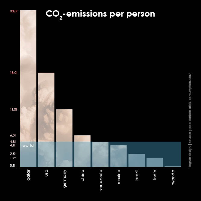
in keeping with the theme, the bars are depicted as smoke columns. other elements related to climate change are included: the global average shows rising sea levels, the left-hand axis is depicted as a thermometer and the unit tonnes can be interpreted as a cross, or equally as dead people.