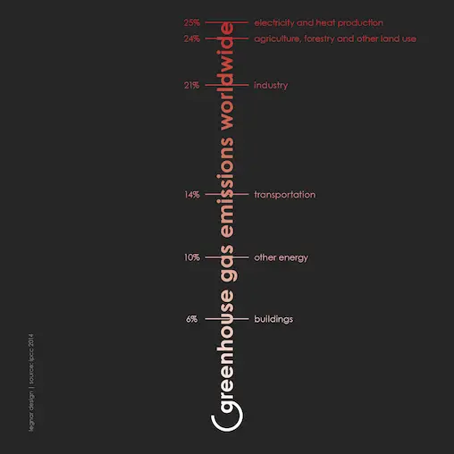
The infographic shows the greenhouse gas emissions worldwide by sector. it is structured like a thermometer. instead of degrees, the percentages increase towards the top. the darker red colour shows which levers are most effective in protecting our climate.