brand design
the design of a brand begins with the concept
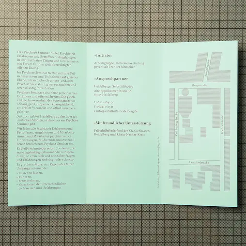
heidelberg psychosis seminar
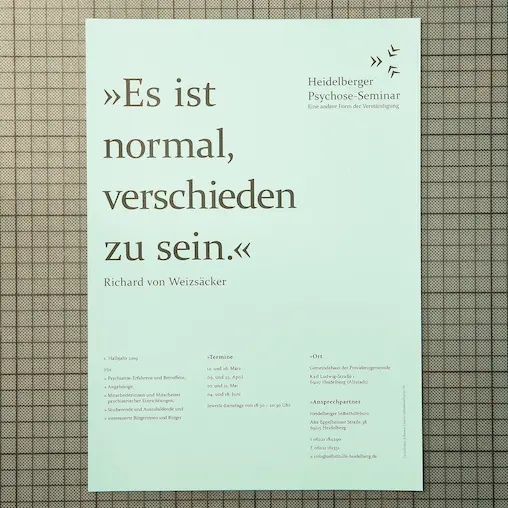
in the trialogue self-help group, people affected by mental illnesses, relatives and people who work in the field come together for a dialogue. the exchange takes place through talking, which is why three guillemets point in a star shape in the middle.
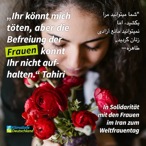
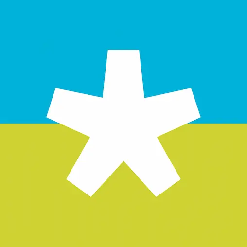
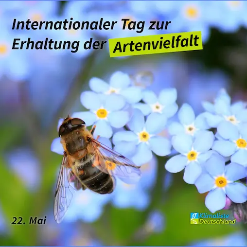
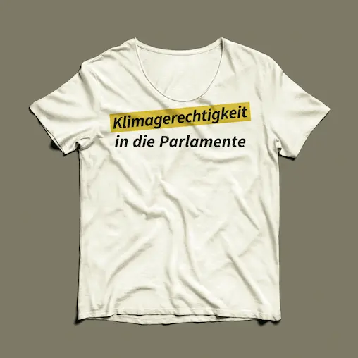
climate list germany


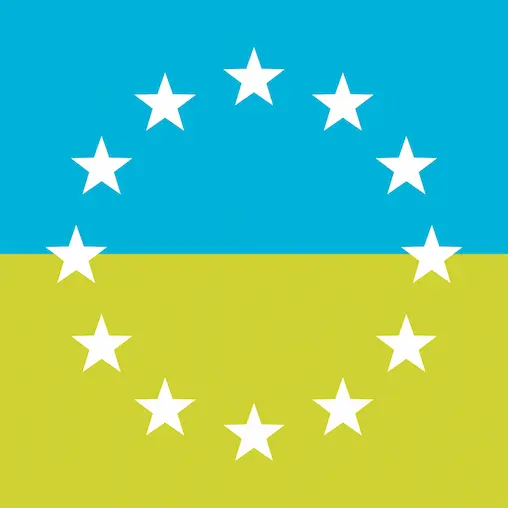
climate list baden-württemberg
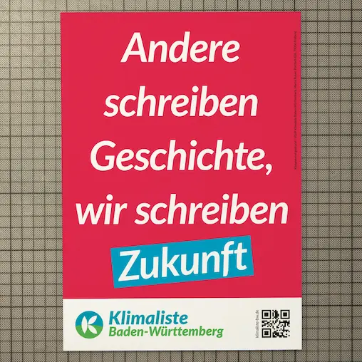
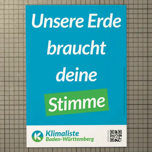
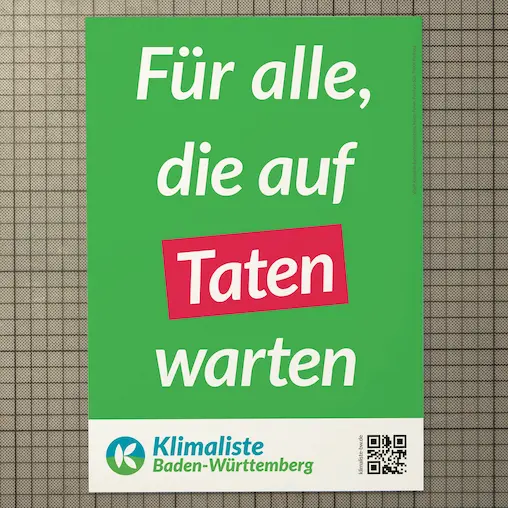
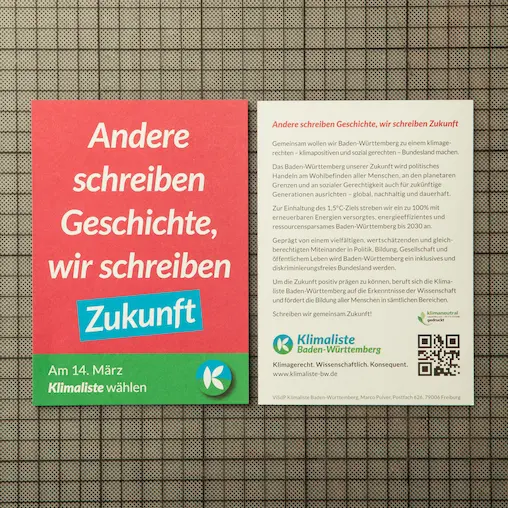
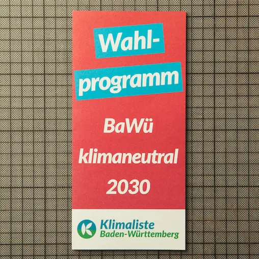
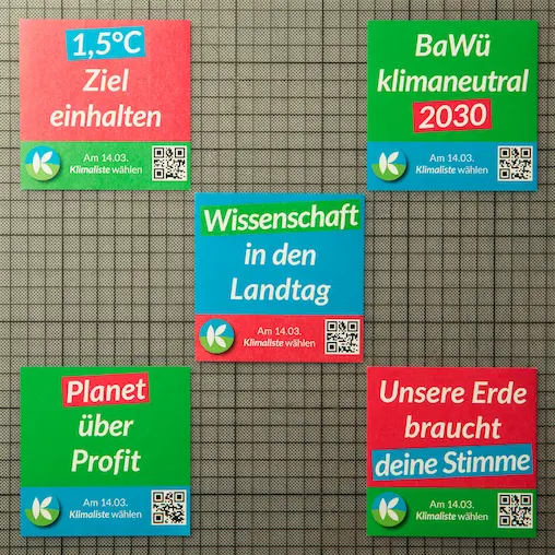
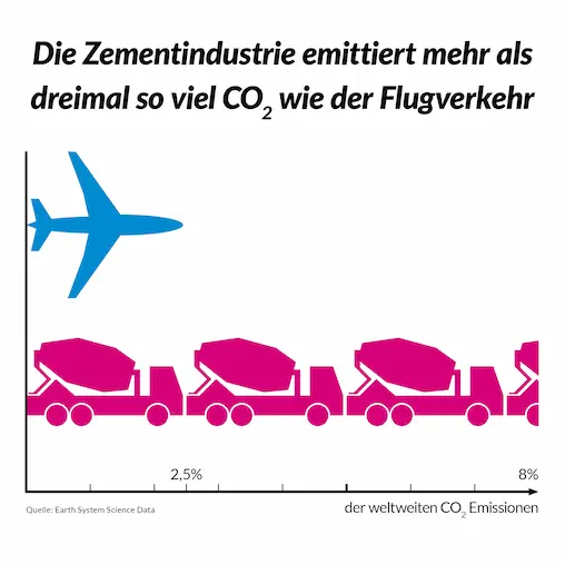
out of the given logo and color palette a young, new and fresh brand design was developed. as the party focuses on climate science and doesn‘t want to support a personality cult primary text, information and data is used. the typographic way in combination with the color scheme grabs attention and looks progressive.
plus
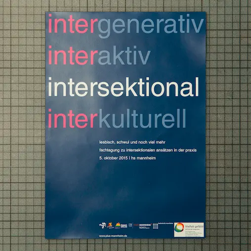
intersectional refers to the intersection of different forms of discrimination. the colouring of the different terms represents these areas in the form of a cross. the colouring chosen for the »psychological lesbian- and gay beratung rhein neckar e.v.« deliberately does not serve any clichés.
gewölbe 42
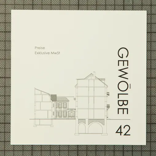
the logo of the event location “gewölbe 42” is a word mark. the term “gewölbe” is turned 90 degrees to run downwards to create depth. the number, on the other hand, is the right way round and symbolises the basement. the line between the term and the number indicates the level of the ground floor.
verena kraus | virtual assistant
the virtual assistent is taking care of project- & event management, social media aupport and back office. to illustrate the work of organisation check was chosen as a design element. as the title includes two Vs, they got replaced by the check. the turquoise colour represents professionalism, experience and trust and addresses the target group out of the sectors action sports, art and sustainability.
no-style-festival
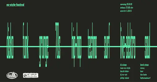
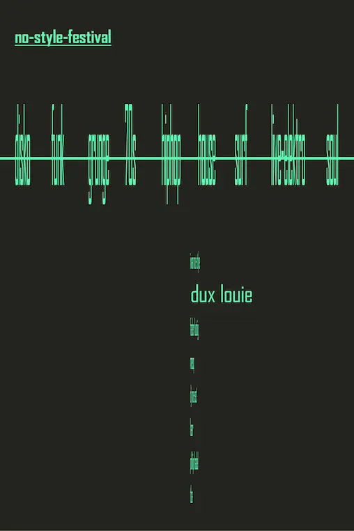
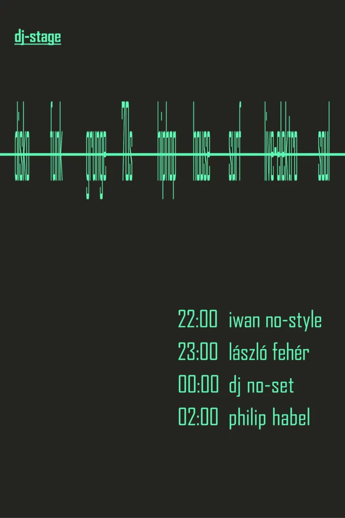
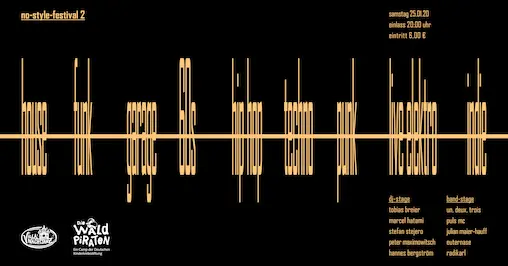
the event with eight bands and djs of different genres unites the music itself. the music genres are represented in typographic solution as amplitude. the colours do not serve a specific genre, but continue to mimic the sound display.
yogaia
the name of the yoga studio contains the word gaia, which means earth. the earth is round and radiates calm. the layers in different earth colours stand for diversity. the lettering in handwriting illustrates the individual approach to each person instead of mass processing.
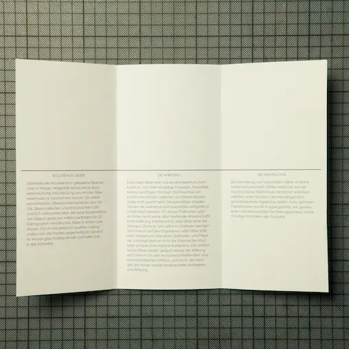
silverhealth
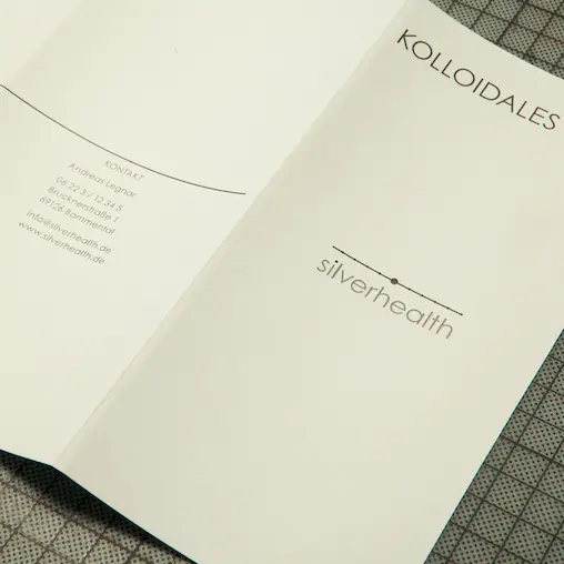

the silver atom has an antibacterial effect, which is why the design is clean and tidy. the logo shows a cross-section of the silver atom, which has 5 shells, with one electron missing from the outer shell. the horizontal line and the circles on it also serve as design elements.