


graphic design
online shop
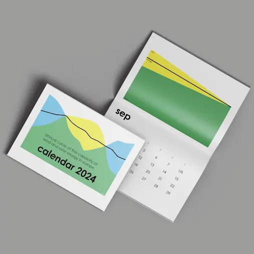
sustainable and minimal designed products, like calendars, cards and prints, are available here.
sustainable minimalistic graphic design
unique design solutions combined with environmental awareness
as a graphic designer and communication designer, i am always looking for an individual design solution that stands out from the competition. the basis for this is a well thought-out marketing strategy. i design out-of-the-box and with attention to detail.
sustainable graphic design starts with a minimalist design and not only visually reduces to the essentials. some resources can also be saved in production. legnar design offers a unique and sustainable design.
my services:
editorial design
infographic
poster design
photography
brand design
contact me for a free initial consultation to get to know each other and your project.
i live and work as a freelancer in clonakilty, county cork in ireland and work independently of location.
in my private life i am involved in social and environmental organizations on a voluntary basis. here you can get to know me better.
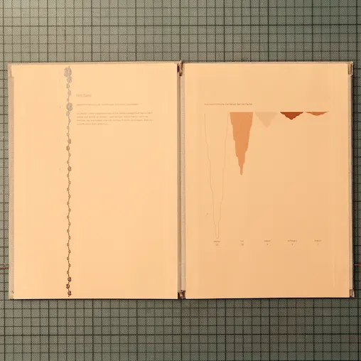
editorial design
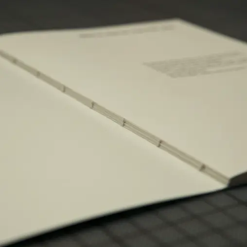
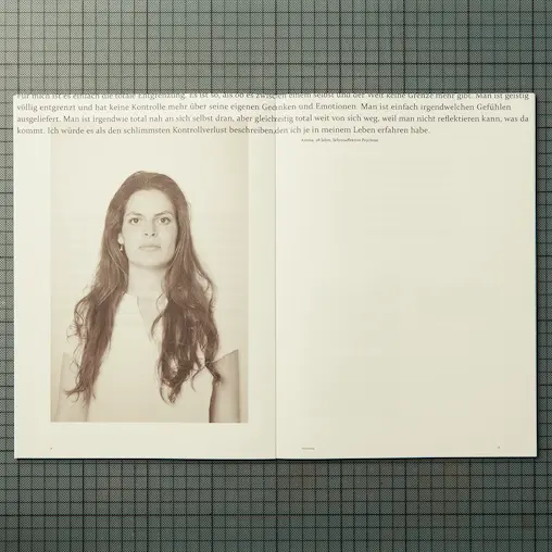
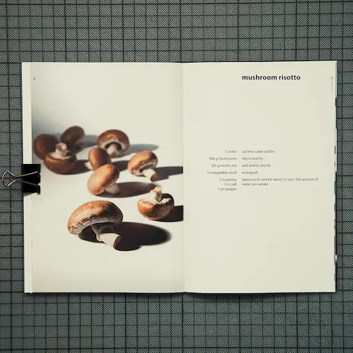
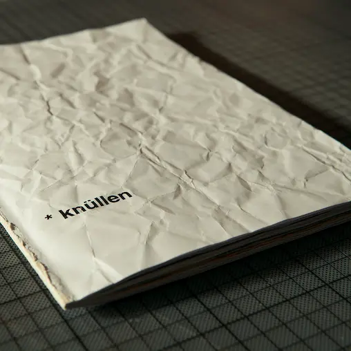
with multi-page media such as books, magazines, brochures, exposés, catalogs, environmental and business reports, it is important to me to have a consistent principle throughout the entire design work. functionality is important so that the viewer can find it´s way around on every page.
in times of digital media, reading print media should also be an experience. that’s why i attach great importance to the feel, choice of paper and type of binding. of course, i also design e-books.
more about editorial design
infographic
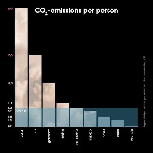
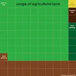
in times of information overload, infographics, in which data is visualized in a short and comprehensible way, are becoming more and more popular. in doing so, as a graphic and communication designer i look for new forms that correspond to the topic (for me, for example, a paper airplane has nothing to do with an e-mail). i work with abstract forms and methods that include chance. infographics are used, for example, in the form of icons and diagrams.
more about infographics
poster design
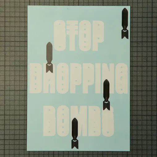
as a creative brand and graphic designer, designing posters gives me particular pleasure. For me posters mean more freedom and are a cultural part of the cityscape. the distant effect and legibility are important, but i also enjoy embedding details that are only noticed when looking closer. i like to use different media for this and go to work by hand.
more about poster design
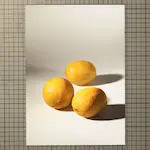
photography
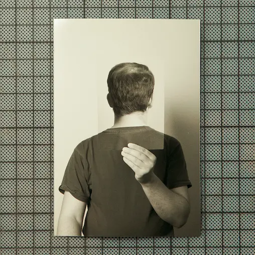

one important side of photography is the technical realization, the visual language is the other one. in times of floods of images on cell phones, the web and social networks, i attach importance to images outside the standard. i pay attention to lighting and angle of view. as photographer my preference is for graphic and abstract arrangements, where shapes and colors speak.
more about photography
brand design
the development of a brand and the associated brand or corporate design starts with the strategy. only when the concept is ready, the graphic work starts. the brand is unique, individual and different from the competition. the design is consistent and timeless. the logo design is the basis on which all other design elements are built. further applications of the brand design can be found on business cards, letterheads, flyers, websites, social media and much more.
more about brand design
sustainability
reducing resources begins with design
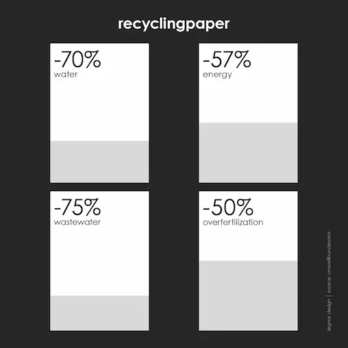
the production of paper and printing ink as well as the glow of the lights on the screen consume resources of our earth. i am aware of their finiteness, therefore i try to turn the possible adjusting screws. in my function as digital design agency i already start by limiting the design elements and minimize printing inks and quantities. i print climate neutrally, with ecological inks and on recycled paper (at least the eco-lable blue angel) and prefer regional suppliers. my computer (as well as all other electrical devices) is powered by (real) eco-electricity. in the digital area, i use a lot of black (instead of white) to save electricity.
since i am part of the climate protection movement, i am actively behind the cause, know a lot about sustainability and benefit from a lot of experience.
minimalism
less is more
as a designer and branding agency i work minimalistically in order to reduce to the essentials and thus create clarity. structure is important to bring about order and functionality. white space is not just emptiness, but leads the eye through the surface. my demand on design is to be timeless, because trends of today are old tomorrow. behind the minimalist design is a philosophy of life that creates more (life-) quality by doing it without.
lowercase letters
two alphabets – two eras
today, we learn upper and lowercase letters, but that wasn’t always the case in the past. the development of latin writing began in the 1st century a.d. with the romans, with the capitalis monumentalis, which consisted of majuscules (upper case letters). over the centuries, the letters were gradually formed into minuscules (lower case letters) through the use of different writing materials. then in the 14th century, at the time of the renaissance, roman culture was revived. the humanists discovered ancient copies in the medieval carolingian minuscules from the 7th century a.d. and assumed that they were originals. they imitated the carolingian minuscule according to the formal language of the gothic rotunda, which was common in italy at that time, and thus created the humanistic minuscule. they combined this with the capitalis monumentalis and created an alphabet of minuscules and majuscules.
since i think the two letter genres do not match stylistically, i prefer to use them each separately.